Most cash-on-delivery orders follow the same path: someone scrolls past an ad on a phone, taps it, lands on a page about one product, and either fills a short form or leaves. That page and that form decide how much of your ad budget turns into orders, and also how many of those orders can actually be confirmed and delivered. A form that accepts any phone number produces orders nobody can reach; a form that asks for too much produces no orders at all. This guide covers the single-product landing page and the COD order form only: the layout, the fields, phone validation, the signals that make a buyer trust a store they have never paid, and the speed of the page on an ordinary phone. If you are still choosing a platform or setting up the store itself, start with our guide to creating a COD online store in Morocco and come back here when you are ready to build the page.
What a single-product COD page has to do
A COD landing page has one job: turn the interest created by the ad into a complete, reachable order. It is not a catalogue and it is not a brand homepage. Everything on it should either answer a question the buyer has about the product or move them towards the form.
Start with the match between the ad and the page. If the ad shows a blue blender at a launch price, the first screen of the page should show that same blender, that same price and the same promise. Advertising platforms measure this too: Google Ads describes landing page experience as how relevant and useful your landing page is to people who click your ad. A buyer who has to search the page for the thing they clicked on is a buyer who goes back to the feed.
Then remove the exits. Google’s web.dev guidance on checkout forms recommends that you limit potential exit points by removing visual clutter and distractions such as product promotions. On a one-product page that means no menu leading to twenty other products, no pop-up offering a newsletter, no links to social profiles in the middle of the page. The only way forward should be the form.
The page from top to bottom
Most converting COD pages follow a similar order, because it follows the order of the buyer’s questions:
- First screen: a clear photo of the product, its name, the price with delivery stated, a one-line benefit and a button that scrolls to the form (or the form itself if it is short enough to fit).
- Proof that it does what the ad said: short videos or photos of the product in use, taken on a real phone rather than studio renders.
- Answers to objections: size, materials, how to use it, what is in the box, how long delivery takes to the main cities.
- Payment and delivery: a plain statement that the buyer pays the courier in cash when the parcel arrives, and that someone will call to confirm the order first.
- The form again: repeat it, or a button to it, at the bottom, so nobody has to scroll back up.
Keep the text short and scannable. A phone screen shows a few lines at a time; long paragraphs are skipped. If the same page serves buyers in Arabic and French, write each version for its reader rather than stacking both languages on one screen.
Which fields the form needs, and which to drop
Every field you add is a reason to stop. The web.dev guide puts it plainly: users are more likely to abandon forms that look long, that are complex, and without a sense of direction. Baymard Institute, which benchmarks checkout flows, found that the average US checkout flow contains 23.48 form elements displayed to users by default, while an ideal checkout flow can be as short as 12-14 form elements. In its survey, 17% of US online shoppers have abandoned an order because the checkout was too long or complicated. A COD order form can be far shorter than any card checkout, because there is no payment step at all.
For most COD products, these fields are enough:
| Field | Why it is there | How to build it |
|---|---|---|
| Full name | The courier and the confirmation agent need to address the buyer | One input, not first name and last name |
| Phone number | Confirmation call and delivery both depend on it | One input, phone keyboard, validated as typed |
| City | Delivery fee and carrier depend on it | A list or a search field with the cities you deliver to |
| Address | The courier has to find the door | One free-text area: neighbourhood, street, landmark |
| Quantity or offer | When the page sells packs (one, two, three units) | Radio buttons with the total price of each |
Leave out email, postcode, a second address line, a company name and anything you do not use to deliver the order. Nielsen Norman Group sums up the business case: every time you cut a field or question from a form, you increase its conversion rate. The same research reports 78% one-try submissions in forms compliant with usability guidelines versus only 42% one-try submissions in forms violating them, so the layout matters as much as the number of fields.
A few rules make the remaining fields easier to fill:
- Present fields in a single column layout, one field per row, so the thumb moves straight down.
- Ask for names with a single input unless you have a good reason not to, and don’t enforce Latin-only characters for names: many buyers will type their name in Arabic script, and a validation rule that rejects it loses the order.
- For the address, consider using a single textarea for address. Moroccan addresses often rely on a neighbourhood and a landmark rather than a street number, and a free-text box accepts all of them.
- Don’t use placeholders on their own instead of labels: the grey hint disappears as soon as the buyer starts typing, and with it the reminder of what the field is for.
Phone validation: the field that decides the order
In COD the phone number is not a formality. It is how the order gets confirmed and how the courier finds the buyer on delivery day. A wrong or fake number turns into an order that cannot be confirmed, or a parcel that comes back. That makes the phone field the one place where a little strictness pays off, as long as it does not block real buyers.
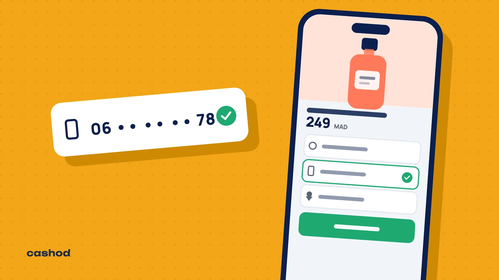
Start with the input itself. The web.dev guide says: for telephone numbers, use type="tel" to get the appropriate keyboard on mobile, so the buyer gets a number pad instead of a full keyboard. It also recommends that you use a single input for phone numbers and do not split the number into parts, and that you validate data during entry, not just on form submission.
Then validate against the real numbering plan of the country you sell in. For Morocco:
- The country code is +212, and all phone numbers in Morocco are 9 digits in length (excluding the leading 0), so a national number has ten digits with its 0.
- Mobile numbers start with 06 or 07 (or +212 6 and +212 7 in international form). The 07 range was opened in 2016, when the regulator allowed operators to assign numbers to their customers starting with 07, so a rule written years ago that only accepts 06 rejects real buyers.
- Accept the formats people actually type: with spaces, with dashes, with +212 in front (or the 00 form of the international prefix), or with the 0. Strip the separators, convert to one stored format, and only then check the length and prefix.
- Numbers starting with 05 are landlines. You may accept them, but flag them for the confirmation team, since most buyers ordering from a phone give a mobile number.
When the number is wrong, say what is wrong next to the field (“this number is missing a digit”) instead of a red border with no text. If you sell in several countries, validate per country rather than writing one rule for all of them.
Finally, explain why you need it. Baymard found that 14% of users would never provide their phone number to an online store, and that 39% of sites in our ecommerce UX benchmark require users to provide their phone number without any sort of explanation. Faced with an unexplained required phone field, some participants in our testing provided false information or abandoned the checkout process altogether. A short line under the field (“We call you to confirm the order; the courier calls you on delivery”) is enough: Baymard reports that explaining why the number is collected alleviates the vast majority of users’ privacy concerns. For COD buyers, it also sets the expectation of the confirmation call, which makes them more likely to answer it.
Trust without a card: what to show near the button
Cash on delivery already removes the biggest fear of an online purchase, because the buyer does not hand over any money before seeing the parcel. What remains are the questions around the price and the process, and the form is where they come up.
- Show the full price before the form. In Baymard’s abandonment survey, the top reason after “just browsing” is 40 % extra costs too high (shipping, tax, fees). If delivery is charged, show it next to the product price; if it is free, say so. A total that grows during the confirmation call starts the relationship with a surprise.
- Say how payment works. “You pay the courier in cash when you receive the parcel” in one line next to the button.
- Say what happens next. A call or a message to confirm, the usual delivery time, and the option to check the product on delivery if you allow it.
- Show real proof. Customer photos, short video reviews and a reachable phone or WhatsApp number do more than badges.
- Name the button after the action. “Order now, pay on delivery” tells the buyer what the tap does, which a generic “Submit” does not.
Speed on an ordinary phone
A buyer coming from an ad is on mobile data, often on a mid-range phone, and has not committed to anything yet. Every second of white screen is an invitation to go back. Google’s web.dev rounds up studies showing that the BBC found they lost an additional 10% of users for every additional second their site took to load, and that for Vodafone: A 31% improvement in LCP increased sales by 8%.
Google’s Core Web Vitals give concrete targets. For a good experience, LCP should occur within 2.5 seconds of the page starting to load (the moment the main image or headline appears), and pages should have a INP of 200 milliseconds or less, which measures how quickly the page reacts to a tap. Google suggests measuring at the 75th percentile of page loads, segmented across mobile and desktop devices, so look at the mobile figures, not at your own office connection.
On a single-product page, the usual culprits are easy to find:
- Heavy images: export photos at the size they are shown, in a modern format, and keep the first one light.
- Autoplay videos at the top of the page: use a poster image and let the buyer start the video.
- Tracking and chat scripts: keep the advertising pixels you actually use and remove the rest.
- Countdown timers, spinning wheels and pop-ups: they cost loading time and they put something between the buyer and the form.
After the tap: double orders, the thank-you page and confirmation
The order is not finished when the button is tapped. Web.dev notes that many users click buttons repeatedly, even if they’re working fine; on a slow connection, that produces two or three identical orders that your team then has to call and cancel. Disable the button as soon as it is tapped and show that the order is being sent.
The thank-you page should repeat the order (product, quantity, total to pay on delivery), confirm the phone number the buyer typed, and say clearly that someone will call or message to confirm. A buyer who knows a call is coming picks up.
A short form also lets more fake or careless orders through. Phone validation filters part of them; the rest is the work of the confirmation step. Our guides on preventing fake COD orders and on confirming COD orders in Morocco cover what happens between the form and the courier.
Test and measure before you scale the ads
Before sending paid traffic, place a few test orders yourself on two or three different phones, on mobile data rather than Wi-Fi, in both languages if the page has two. Check that the order arrives complete, that a number typed with spaces or with +212 is accepted and stored in one format, and that an Arabic name is not rejected.
Once traffic flows, follow three numbers per page: visits, submitted forms, and orders confirmed. A page that converts visits into forms but whose orders are rarely confirmed has a form problem (unvalidated phones, unclear price) rather than an advertising problem. Change one thing at a time, such as the first image, the price display or the number of fields, and compare over enough orders to be sure the difference is real.
Where Cashod comes in
The landing page and the form collect the order; confirmation and delivery come next. Cashod includes a call center where agents confirm COD orders by phone, and it can confirm orders over WhatsApp, including with an AI agent. One Cashod account can manage several stores, which helps when you run one landing page per product or per market. To see how your store or form can send its orders, visit the integrations page.